

Website wireframes sketched in a notebook, taken by picjumbo.com on Pexels.
Prefer to listen? Here are the key points from me in under a minute.
Read the transcript
Hi, Joshua here. In this article I talk about what good website design looks like for a small business. This is what I know. Some design rules work on almost every website, because they come from how people’s brains take in information. Others depend on your industry and your customers, so you need to adjust them. Start with your Google title and description, because that’s where the first impression happens. Then put everything important at the top of the page, before anyone scrolls. Make your pages easy to scan, and write copy that actually sounds like you. Choose colours and fonts that suit your industry. Show proof that people can trust you, and give them a clear next step at the points where they make decisions. Check every page on your phone, and keep it fast. Then watch how real visitors use your site before you change too much. If you’d like to learn more, keep reading.
In short
- People judge how a website looks within a fraction of a second, so the top of every key page has to earn the next scroll.
- Most visitors scan. Clear headings with the answer directly underneath help both people and AI tools find what they need.
- Colours, fonts and tone should suit your industry and stand out a little from the competitors ranking above you.
- About three quarters of South African web traffic comes from phones, so check every page on a phone and keep it fast.
- Put proof and calls to action where people make decisions, not only at the bottom of the page.
- A free tool like Microsoft Clarity shows how real visitors use your site. Let enough data build up before you act on it.
Good website design follows a few rules that work on almost every site, because they come from how people’s brains take in information. The rest depend on your industry, your customers and the competitors you’re up against, so they need adjusting case by case.
I build websites for small businesses around Durban and set them up to rank on Google. Below are the ten rules I lean on most, in the order your customers experience your site: from spotting you on Google to deciding whether to message you. Each one ends with what stays the same for everyone and what you should change for your own business.
Not sure how your current website measures up? WhatsApp me the link and I’ll tell you what I’d fix first.
What makes a website design good?
A good website design helps the right visitor find what they need quickly, trust you, and take the next step. Looking polished helps, but plenty of attractive sites still leave visitors confused or unconvinced.
I find it useful to split design decisions into two groups. Fixed rules come from how human attention and memory work, so they barely change between audiences. People skim, they make snap judgements, and they get overwhelmed by too many choices, whether they’re buying paint or booking a dentist. Flexible rules come from expectations, culture and intent. What feels trustworthy for a law firm feels stiff for a kids’ party business, and the right colours for a pest control company would look odd on a spa.
Most design advice online treats everything as fixed. That’s why so many small business websites end up looking like the same template with a different logo.
#1 Win the click with your Google title and description
Your website’s first impression happens on Google, before anyone visits. The blue headline and the short description under it in the search results are the first thing a potential customer reads about you, and they decide whether the click goes to you or to the business listed above you.
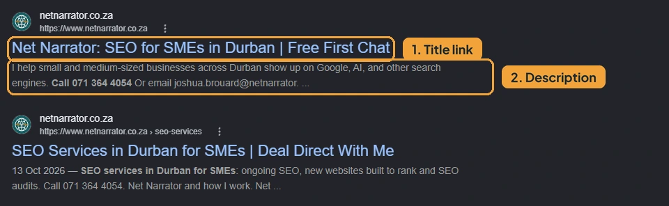
The headline is called a title tag, and the text under it is the meta description. A strong title says what you do, where you do it, and gives one reason to pick you. My homepage title, for example, is “SEO for SMEs in Durban | Free First Chat | Net Narrator”. The description then expands on that reason and ends with a short nudge to click.
Whatever you promise there, the page has to deliver. Researchers Peter Pirolli and Stuart Card at Xerox PARC called this information scent: people follow links that look like they lead to what they want, and give up the moment the trail goes cold. If your description mentions prices and the page has none, visitors hit the back button and choose someone else.
A few practical pointers:
- Keep titles to about 50-60 characters and descriptions to about 150 to 155, so they don’t get cut off.
- Write each one for the search it targets, using the words people actually type.
- On WordPress, edit them in Yoast or Rank Math (SEO plugins you can download). Wix and Squarespace keep them in each page’s SEO settings.
Don’t panic if Google shows a different meta description. Google’s guide says it draws on several sources, so keeping your title and heading consistent gives it fewer reasons to swap them.
- Fixed rule: a clear title and description that match the search and the page.
- Flexible rule: which reason to click you lead with. Speed suits emergency trades, credentials suit medical practices, and price suits competitive local services.
#2 Put your most important information above the fold
Everything that convinces a visitor to stay should be visible before they scroll. That area is called “above the fold”, and it’s the most important part of any service page or landing page.
People decide very quickly. A 2006 study led by Gitte Lindgaard at Carleton University found that people formed an opinion of a website’s visual appeal within about 50 milliseconds, and those snap ratings closely matched how they rated the same sites after looking for longer. Attention also stays near the top. Nielsen Norman Group’s eye-tracking research found that 57% of viewing time went to content above the fold, and 74% to the first two screenfuls.
Above the fold, a visitor needs a reason to trust you and a reason to keep reading. That usually means:
- a headline that says what you do and where
- one or two trust signals, such as years in business, a registration number or review ratings
- a clear next step, like a WhatsApp or call button
- an image or icons that support the message
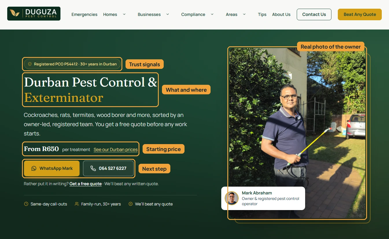
Duguza Pest Control’s homepage fits all of this into the first screen: a badge with their pest control registration number and 30+ years in Durban, a starting price, WhatsApp and call buttons, and a photo of the owner at work.
That photo does more than it might seem. People are visual, and a real image of the owner, the team or the finished work beats a stock photo of a handshake every time. A little creativity goes a long way here too: icons beside trust signals, a short strip of stats, or a photo overlapping the edge of the section all make it feel considered. Keep every image sharp and properly sized, because a blurry or stretched photo undoes the trust you’re trying to build.
Common mistakes that waste this space:
- rotating sliders that move on before anyone can read them
- vague slogans like “Excellence in everything we do”
- a huge banner image that pushes all the text below the fold
- cookie banners or chat pop-ups covering the main button
Remember that the fold sits much higher on a phone. Check what shows on a phone screen before you call this section done.
- Fixed: what you do, why to trust you and what to do next, all visible on load.
- Flexible: what leads. A pest control company leads with speed and price, a medical practice with credentials, a restaurant with the food.
#3 Make every page easy to scan
A scannable page lets visitors jump to the part they care about and find their answer without reading every word. Most people don’t read web pages from top to bottom. They hop between headings until something catches their attention.
Nielsen Norman Group’s eye-tracking studies found that when a page gives no visual cues, people fall back on an F-shaped pattern: they read across the top, a little way across further down, then skim down the left edge. Anything outside that shape gets missed.
The fix is to give the eye somewhere to land:
- Clear headings that use the words people search for.
- A direct answer in the first sentence under each heading. If someone scrolls to “How much does it cost?”, the next line should give a price or a range.
- Mixed formats. Bullet points, short tables, numbered steps and the odd bold phrase break up long blocks of text.
- Different block styles for different kinds of information, such as cards for steps or a highlighted box for a key fact.
A quick way to test this: read only the headings on your page. If they tell the whole story on their own, the page is scannable.
On blog posts, a short summary at the top helps skimmers get the gist. I add an “In short” box to every guide, along with a voice note where I talk through the key points in under a minute. Video works the same way. Some people would rather listen or watch than read, and giving them the option keeps them on the page.
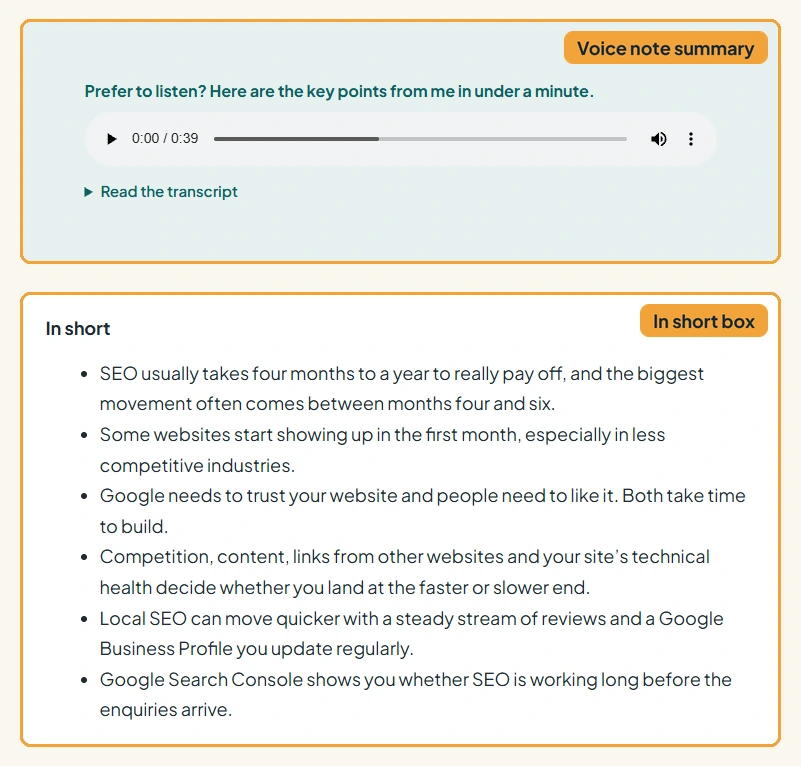
There’s a bonus, too. AI tools like ChatGPT and Google’s AI Overviews look for clear questions with direct answers when choosing what to quote, so the same structure helps you get found on ChatGPT and other AI tools.
- Fixed: clear headings, direct answers and varied formatting.
- Flexible: which formats you lean on. A price-heavy page suits tables, a process suits numbered steps, and a technical service may need short explainer videos.
#4 Write copy that sounds like a real business
The words on your website decide whether you come across as a real business or a template. People may scan, but when they stop to read, generic copy tells them nothing about why they should pick you.
This has become a bigger problem since AI writing tools took off. Many small business owners now generate their website copy in minutes, and the result reads the same everywhere: smooth, polite and forgettable.
You have two good options. The first is to write it yourself, in your own voice or the voice you want your business to have. As long as it’s clear and gets to the point, your own words will almost always beat a generic version.
The second is to use AI properly. If you’re short on time, that’s fine, but give it something to work with:
- Your facts. Prices, the areas you serve, years in business and real customer stories.
- Your voice. Paste in a few emails or WhatsApp messages you’ve written, or record yourself talking through the topic and ask it to tidy up your words without rewriting them.
- Your rules. Who your audience is, what to avoid, and examples of copy you like. You can even ask the AI to research what good copywriting looks like in your industry first.
- A final read. Always check what it produces. AI will happily invent a guarantee you don’t offer.
Google has said in its guidance about AI-generated content that it rewards helpful content however it was produced, so using AI is fine as long as the result is useful and accurate.
Plain language also makes you sound more expert. In a 2006 study, Princeton psychologist Daniel Oppenheimer found that writers who used needlessly complex words were rated as less intelligent than those who kept things simple. If you want to come across as the expert in your field, explain things simply.
Specific details persuade more than impressive-sounding claims. “Family-run, 30 years in Durban, we reply within the hour” tells a visitor far more than “quality service you can trust”. Write to the reader, too. More “you” and less “we” keeps the focus on their problem.
Watch out for phrases that make copy sound machine-made, such as “in today’s fast-paced world”, “elevate your experience”, “seamless” and “peace of mind”. Readers are learning to spot them.
- Fixed: clear, specific copy that makes your selling point obvious.
- Flexible: tone. A small family business should sound personal and warm, while a firm positioning itself as the industry authority can be more formal, as long as it stays easy to follow.
#5 Choose colours and fonts that fit your industry
Your colours and fonts shape how your business feels before anyone reads a word. A website can look polished and still send the wrong message for its audience.
Colour psychology is full of shaky claims online, so be careful with confident statistics about what each colour “means”. The research that holds up is more useful anyway: what matters most is whether a colour feels right for the type of business. A 2006 study by Paul Bottomley and John Doyle found that people judged brand logos as more appropriate when the colour suited the kind of product being sold.
The practical way to use this is to look at who’s already winning. Search your main service in your area, open the top three results, and note their colours, fonts and overall mood. People expect your website to feel familiar, an idea known as Jakob’s Law: visitors spend most of their time on other websites, so they expect yours to work and feel like the ones they know. Once you understand what your industry looks like, you can decide how far to stand out.
Fonts matter just as much. A rounded, playful font on a law firm’s website feels as wrong as neon colours on a funeral home. If you run a serious business, avoid anything that looks childish. Whatever you choose, text must be easy to read. Aim for a contrast ratio of at least 4.5:1 between text and background, which is the WCAG AA accessibility standard.
Use colour to break up the page
Even with good headings and varied formats, a page that’s white from top to bottom can feel like reading a business presentation. Changing the background colour between sections keeps it feeling fresh and gives the eye places to rest.
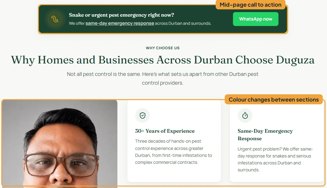
There’s psychology behind this too. The Gestalt principle of common region says people see things inside the same coloured area as belonging together, so a tinted band around your pricing tells visitors “this is one topic” before they read it. The von Restorff effect, sometimes called the isolation effect, says the thing that looks different is the thing people remember. If your WhatsApp button is the only bright orange element on the page, eyes go straight to it.
Mix it up by alternating between colours already in your palette, and resist adding new ones. A rough rule of thumb designers use is 60-30-10: 60% main colour, 30% supporting colour and 10% accent. And check contrast on every background colour, since text that reads well on white can struggle on a tint.
- Fixed: readable text, a consistent palette and visual breaks between sections.
- Flexible: the palette itself, and how bold you go. A kids’ party business can use big contrasting blocks, while a law firm might stick to subtle shifts between white and soft grey.
Want an honest first take on your website’s design? WhatsApp me for a free first chat.
#6 Show proof that you can be trusted
Visitors need evidence that you’re real and good at what you do before they get in touch. This matters most for newer businesses that people haven’t heard of yet.
Two psychological principles explain why proof works. Social proof means people look to what others have done when they’re unsure, which is why reviews are so persuasive. Authority means credentials and qualifications reduce the sense of risk.
Reviews need to come from somewhere visitors trust. Testimonials typed straight onto your own website are easy to fake, and many visitors know it. A widget that pulls reviews from Google, or a third-party badge, shows they came from real customers.
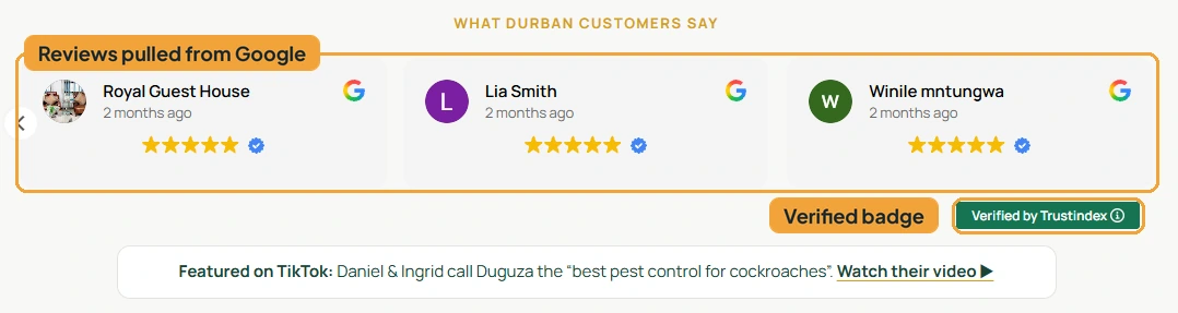
On Duguza’s homepage, the “What Durban customers say” section pulls in their Google reviews with a “Verified by Trustindex” badge underneath, plus a link to a TikTok video where customers recommend them.
Case studies work well too, especially placed where doubt is likely to creep in, such as near pricing or just before a call to action. Numbers make them stronger. When Duguza’s new website went live in mid-July 2026, it was ranking for 29 search terms in South Africa within about eleven weeks and appearing as a source in Google’s AI Overviews. That says far more than “great results”. Always ask clients before sharing their name or results.
If you’re brand new and don’t have reviews yet, lean on what you do have: your face, your story, your qualifications and a clear explanation of how you work.
- Fixed: proof from sources visitors can check, placed where people hesitate.
- Flexible: which proof leads. Tradespeople lean on reviews, medical practices on qualifications, and new businesses on the owner’s background.
#7 Place calls to action where people make decisions
A call to action, or CTA, is a button or prompt that asks visitors to take the next step, and it should appear wherever someone might be ready to act. Think “WhatsApp us” or “Get a quote”, placed throughout the page rather than only at the bottom.
Visitors don’t all decide at the same moment. Some know what they want the second they land. Others need to see your prices first, and some read every word before getting in touch. A website that informs people but never asks them to act leaves enquiries on the table.
Where to place them:
- Near the top, for people who already know what they want.
- After the section that answers the big question, often pricing or how the process works.
- At the end, for the careful readers.
Match the wording to the moment. After a pricing section, “Get an exact quote” fits better than “Contact us”. Duguza’s homepage has a mid-page banner aimed at urgent jobs (“Snake or urgent pest emergency right now?”) with a WhatsApp button right beside it, which you can see in the colour section above.
Use the channel your customers use. For most South African small businesses that’s WhatsApp, especially on mobile. An email-only contact form can feel like too much effort for someone on their phone.
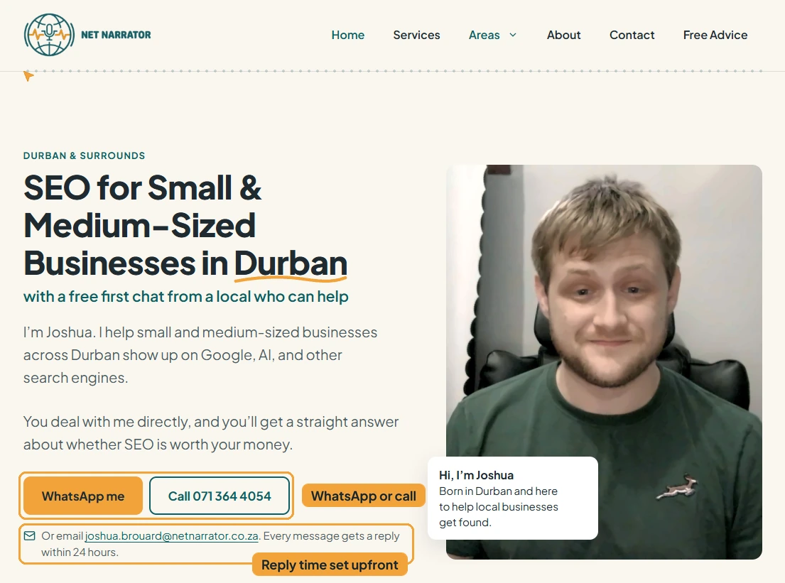
Keep friction low. Every extra form field is another reason to give up, so ask only for what you need to reply. It also helps to answer the unspoken question of whether anyone will respond. My homepage says every message gets a reply within 24 hours, which takes away some of the hesitation about reaching out.
Make the button stand out with your accent colour, as covered in the colour section. Try to stick to one main action per page, because three different buttons asking for three different things split attention. On phones, a sticky call or WhatsApp bar at the bottom of the screen keeps the next step one tap away.
If you have Google Analytics set up, track WhatsApp clicks, calls and form submissions so you can see which CTAs actually get used.
- Fixed: a clear next step at every decision point.
- Flexible: the channel and wording. A plumber wants “Call now”, a clinic wants online booking, and a consultancy might prefer “Book a free 15-minute chat”.
#8 Organise your menu around what customers look for
Every important page on your website should be easy to reach from the menu. It sounds obvious, but it trips up a lot of businesses. Pages get created and never added to the menu, or they end up buried three levels deep.
When that happens, the page is close to invisible unless someone lands on it straight from Google. Say you run a paint store in Durban. Someone searches “paint supplies Durban”, lands on your homepage, but wants a specific waterproofing product that’s hidden deep in your website. If they can’t find it quickly, they’ll leave and buy from a store whose website makes it easy.
A few principles from earlier come back here. Hick’s Law says the more options people face, the longer they take to decide, so a menu with 14 items is harder to use than one with six. Jakob’s Law says people expect menus to sit where they usually do and use familiar labels. And information scent explains the paint store example exactly: when the links stop pointing towards what they want, people give up.
How to get it right:
- Use your customers’ words. “Solutions” or “Offerings” mean nothing to a visitor. “Paint”, “Brushes and Rollers” and “Waterproofing” do.
- Mind the order. People remember the first and last items in a list best, known as the serial position effect, so put your most important page first and Contact last.
- Give people more than one route. Links in your page copy, breadcrumbs, an “On this page” menu on long pages and a tidy footer all help visitors find their way. Duguza’s homepage uses a side menu that follows the reader down the page.
- Add search on bigger websites. For a store with hundreds of products, a search bar often beats any menu.
There’s an SEO side too. Pages that nothing links to are harder for Google to find, so a buried page loses with customers and search engines alike.
A simple check: list every page on your website and confirm each one can be reached from the menu or from a main page. Then open the menu on your phone, because mobile menus are where pages most often go missing.
You may have heard of the “three-click rule”, which says every page should be reachable in three clicks. People will happily click more often than that as long as each click feels like progress. What matters is that every click clearly gets them closer.
- Fixed: a clear, predictable menu with plain labels.
- Flexible: how deep it goes. A five-page plumber website needs a flat menu, while a store with hundreds of products needs categories, filters and search.
#9 Check your website on phones and tablets, and keep it fast
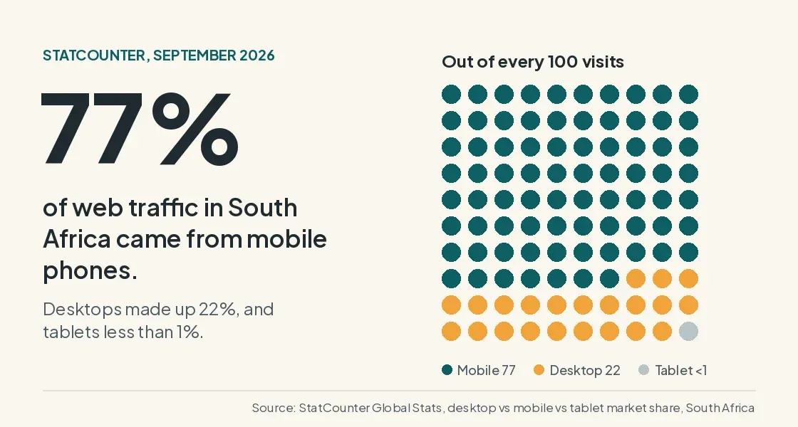
Most of your visitors will see your website on a phone, so every page needs to work well on a small screen. According to StatCounter, about 77% of web traffic in South Africa came from mobile phones in September 2026, compared with 22% from desktops.
If you build your website with WordPress blocks or a builder like Wix, most elements adjust to smaller screens automatically. Problems start when you customise layouts or add your own CSS. You’re almost certainly designing on a laptop or home computer, so it’s easy to miss that something looks broken on a phone.
How to preview your website on different screens
On a live website in Google Chrome:
- Right-click anywhere on the page and choose Inspect.
- Click the small phone and tablet icon at the top left of the panel that opens, just to the left of the Elements tab. The shortcut is Ctrl+Shift+M on Windows or Cmd+Shift+M on Mac.
- Pick a device from the dropdown at the top of the page, or type in your own dimensions. You can preview phones, tablets and foldables.
The preview is a good start, but test on a real phone as well. It’s the only way to see slow loading, buttons that are awkward to tap, or a pop-up that won’t close. Try an older, cheaper Android if you can, because plenty of your customers will be using one.
When you check, look for:
- text that’s readable without zooming
- no sideways scrolling
- buttons that are easy to tap. Google suggests tap targets of about 48 pixels with roughly 8 pixels between them. This ties back to Fitts’s Law: bigger, closer targets are quicker and easier to hit.
- key information and contact options near the top, without having to scroll far
- pop-ups and cookie banners that don’t cover anything important
If you’re not sure how to fix something with CSS, there’s plenty of help online. AI tools like Claude are also good at explaining what a setting does or why a layout breaks.
Some websites show content differently on mobile, especially text-heavy pages or ones with large images. That’s fine, but keep the important content on both versions. Google uses the mobile version of your pages for indexing and ranking, so content missing from mobile may not count. Google’s mobile-first indexing guide recommends responsive design, and says collapsing content into accordions or tabs is fine as long as it matches the desktop version.
Why speed matters even more in South Africa
Many South Africans browse on mobile data, which is expensive and sometimes slow. A heavy page costs your customers money as well as patience.
You can test your speed for free with PageSpeed Insights. Check the mobile tab first, since that score is usually lower and matters more. The report can look technical, so here’s what the main terms mean.
PageSpeed Insights shows two kinds of results. Field data comes from real Chrome users who visited your website over the past 28 days. Lab data comes from a simulated test run on the spot. Field data shows what your visitors actually experience, while lab data is handy for spotting problems. Newer or quieter websites often only show lab data, because there aren’t enough visits yet. Google explains both in its guide to PageSpeed Insights.
What LCP, INP and CLS mean
The three Core Web Vitals are the measurements Google pays most attention to. Your page passes when all three are rated good, using the thresholds Google publishes:
| Metric | What it measures | Good score | Common fixes |
|---|---|---|---|
| LCP (Largest Contentful Paint) | How long the biggest thing on screen, usually your main image or headline, takes to appear | 2.5 seconds or less | Compress your main image, use the WebP image format, avoid sliders at the top, choose faster hosting |
| INP (Interaction to Next Paint) | How quickly the page responds when someone taps or clicks | 200 milliseconds or less | Remove unused plugins and heavy scripts, cut back on chat widgets and tracking tags |
| CLS (Cumulative Layout Shift) | How much the page jumps around while it loads | 0.1 or less | Set image sizes, reserve space for banners and embeds, load fonts properly |
You’ll also see a few supporting measurements:
- FCP (First Contentful Paint): when the first text or image appears. Good is 1.8 seconds or less.
- TTFB (Time to First Byte): how quickly your server starts responding. Good is 0.8 seconds or less, and slow results usually point to your hosting.
- TBT (Total Blocking Time) and Speed Index: lab measures of how long the page is too busy to respond, and how quickly it visually fills in.
Practical ways to speed up your website
- Images. Compress them and save them as WebP. On most small business websites, this is the biggest easy win.
- Videos. Host them on YouTube or Vimeo and show a thumbnail that only loads the player when someone clicks. My website does this, so the page doesn’t wait for a video before anyone can read it.
- Code that loads everywhere. Many websites load every style and script on every page, even where they aren’t needed. Making CSS and scripts page-specific and tidying up backend code is a job for your developer, so it’s worth asking them.
- Plugins and hosting. Remove plugins you don’t use, turn on caching, and choose hosting with servers that respond quickly.
- Fixed rule: every page readable, usable and fast on a phone.
- Variable rule: what shows first on mobile. A plumber wants a big call button at the top, while a restaurant probably leads with the menu or bookings.
#10 Watch how real visitors use your website
Your website isn’t finished on launch day, and watching how real people use it shows you which flexible rules need adjusting for your audience. Microsoft Clarity is free and shows you exactly that. Once it’s set up, you can see:
- Heatmaps of where people click and how far they scroll.
- Recordings of real visits, with personal details hidden.
- Rage clicks, where someone taps the same spot repeatedly because they expect something to happen. These often point to a button or image that looks clickable but isn’t.
- Dead clicks, where someone clicks and nothing changes.
- Quick backs, where someone leaves a page and comes straight back, which can mean a link didn’t take them where they expected.
Microsoft’s Clarity documentation explains each of these in more detail.
Be upfront about using it. Mention Clarity in your privacy and cookie policies, and use a cookie banner that lets visitors decline. Under POPIA, telling people what you collect and giving them a way to object is part of handling their information responsibly.
My most important tip here is to be patient. One recording is an anecdote. Look for the same behaviour across many visits, ideally over a few weeks, before you change anything. Small local websites get very different amounts of traffic, so there’s no magic number, but the fewer visitors you have, the longer you should wait. When you do make changes, change one thing at a time so you can tell what made the difference.
This brings everything back to where we started. The fixed rules give you a strong starting point, and real visitor behaviour tells you how to set the flexible ones for your customers.
- Fixed rule: tracking real behaviour, with visitors’ consent.
- Variable rule: what you act on, based on what your own visitors do.
Should you do this yourself or hire someone?
You can check and improve most of this yourself, and plenty of owners do with a website builder and some patience. I build websites for a living, so I’m not neutral here, but good advice should still be useful even if you never hire the person who gave it.
Where it gets harder is the technical side, such as speed fixes, custom code and setting everything up so Google understands your website. If that’s where you’re stuck, a new website built to rank may save you time. And if you’re still deciding whether you need a website at all, I cover that in do I need a website if I already have a Facebook page or Google profile?
Questions Durban business owners ask about website design
What are the principles of good website design?
Good website design makes the purpose of a page clear immediately, is easy to scan, works well on phones, loads quickly and guides visitors to a next step. Beyond that, colours, tone and layout should fit your industry and audience.
What are the 7 C’s of a website?
The 7 C’s are a framework from Jeffrey Rayport and Bernard Jaworski for thinking about how websites serve customers: context, content, community, customisation, communication, connection and commerce. It’s a useful checklist, though most small business websites focus mainly on context, content and communication.
Does website design affect SEO?
Yes. Google looks at page experience, including how well your pages work on mobile and how quickly they load, and a clear structure helps Google understand what each page is about. Good design also earns more clicks from search results and keeps visitors on your website for longer.
Should I use a website builder or hire a web designer?
A builder like WordPress, Wix or Squarespace works well if you’re comfortable learning as you go and your website is fairly simple. Hiring someone makes more sense if you need custom features, have a lot of pages, or want the website built to rank on Google from launch.
Is it okay to use AI to write my website copy?
Yes, as long as the result is accurate, helpful and sounds like your business. Give the AI your real facts, examples of your writing and clear rules, then edit and fact-check everything it produces.
How often should I redesign my website?
There’s no fixed timeline. Rather than starting from scratch every few years, make small improvements based on what tools like Clarity and Google Search Console show you, and consider a bigger rebuild when the website no longer works well on phones or no longer reflects your business.
Want a second opinion on your website?
Every business is different, so the right design depends on your industry, your customers and who you’re up against. Your first chat with me is free. Send me your website and I’ll tell you what’s working, what I’d change first, and whether a rebuild is worth it. You can also see how my SEO services work, or read how to get your business found online for the bigger picture.